| Table of Contents | ||
|---|---|---|
|
| Info |
|---|
See size and cropping specs for specific content types on SF.gov. |
Photography style
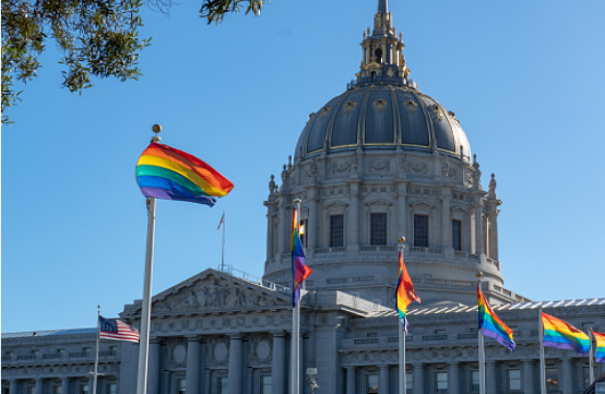
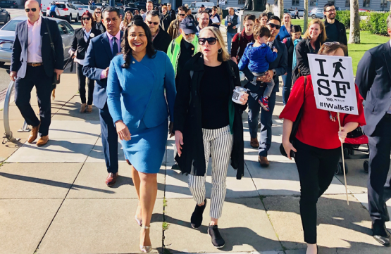
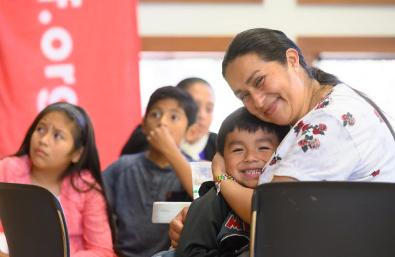
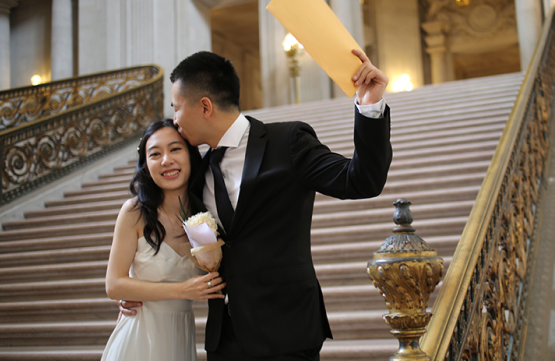
On SF.gov, we use photos with natural lighting, real people, and real places.
We want to capture San Francisco realistically and honestly. Our website is designed to be clear and straightforward, and our imagery should be clean and direct as well.
The best images are real photos from your department's work. For example, that can be from events, around the work site, or of people who use your services (with their permission).
When to use photos
| Info |
|---|
Only use photos when it enhances your message. |
Photos are a type of content, just like words. Think about what value your photo will add. If your photo does not add meaning, you should not use a photo or find another one. Don’t add photos just for decoration.
Permissions and rights
Use photos that the photographer and subjects have given permission to use. Or you can purchase the rights to the photo from a stock photo website, like gettyimages.com.
If you choose to use a photo with a public copyright license, such as Creative Commons, you must include an attribution. You will need to include:
The title of the image (if available)
The creator or photographer’s name
A link to the original source
The type of license that allows you to use the image
Example: | “Dave The Goat” by Case Farm, CC BY 2.0 |
|---|
Alt text
You must add alt text (or alternative text) when you upload an image to SF.gov. Alt text helps people understand the meaning of an image if they cannot see it. It is read out by screen readers, or displayed if an image does not load or if images have been switched off.
Learn how to write good alt text in the Accessibility guide.
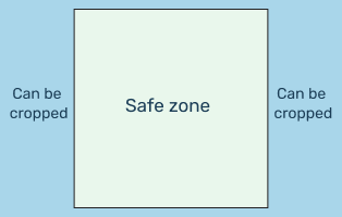
Cropping
| Info |
|---|
Keep subjects in the center of the image to avoid cropping. |
Images are sometimes cropped to fit in the page. Exactly how it is cropped can depend on the size of the viewer’s screen and the length of the text on your page.
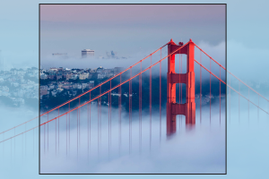
Horizontal
| Tip |
|---|
Main subject is near the center |
| Warning |
|---|
Main subject is on the side, could be cropped |
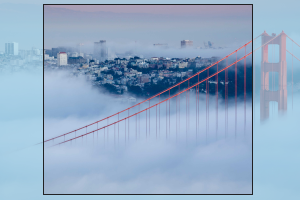
Vertical
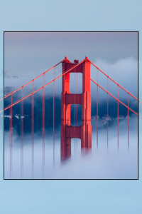
| Tip |
|---|
Main subject is near the center |
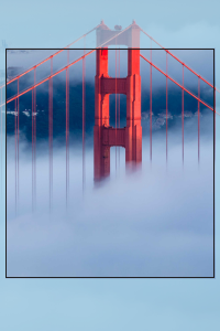
| Warning |
|---|
Main subject is near the top or bottom, could be cropped |
Things to avoid
1.
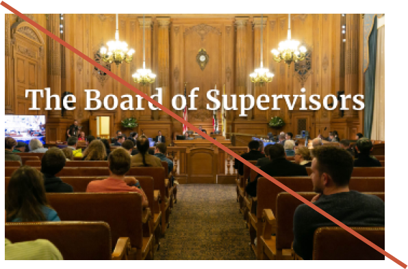
Avoid imagesImages with text are not allowed
Text that is embedded in an image can't be read by screen readers. Images with words or numbers on them are not accessible, can't be translated, and because sighted users can get information from them while people who use screen readers can’t.
Images with text won’t display right on smaller screens like phones. For low vision users, who frequently magnify webpages, the images won't scale properly if users are using text enlargement. It's also easier easy for it text in images to get accidentally cut off or distorted.
Text in images also cannot be translated.
Note: Incidental text that isn't meant to be read is OK (like a sign that happens to be in the background of a photo).
| Warning |
|---|
Text overlaid on a photo |
| Warning |
|---|
Text saved as an image |
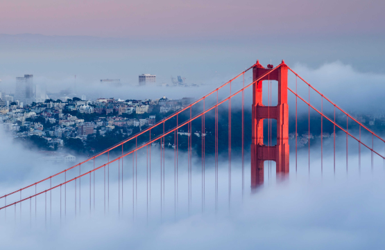
2. Avoid abstract and artistic photography, or special effects.
While these images may be attractive, they are more artistic than functional. They look artificial or obscured, and the meaning may not be clear.
| Warning |
|---|
Abstract or artistic |
| Warning |
|---|
Strong filters |
| Warning |
|---|
Special effects |
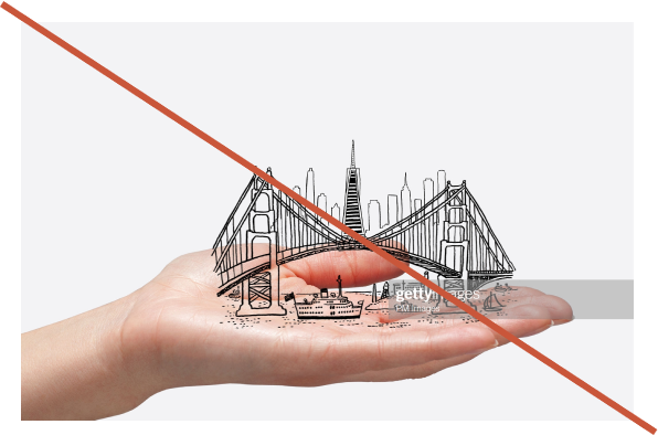
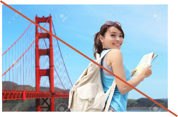
3. Avoid stock photos that appear artificial or posed.
Posed models or stock photos feel less genuine and relatable. Metaphors may have hidden meanings that are not obvious or understandable to everyone.
| Warning |
|---|
Posed models |
| Warning |
|---|
Metaphorical objects |
| Warning |
|---|
Studio stock photos |